Indulging a Taste for Color
Q: I love color! I wear it and live in it. At least, I did before I married my architect husband. He has very strong reactions to colors. If it's not black, white or gray, he says it's "too garish" and "in bad taste." Maybe you can help by writing about people who have good taste and also love color?
A: In a New York minute! There's not enough space in this column to list all the world's tastemakers who have championed the use of intensive colors in home interiors.
So I'll start with Jamie Drake, a highly regarded interior designer-to-the-carriage-set who not only decorates with great colors, he also wears them! Check out his website, drakedesignassociates.com, and see him in a bright red suit! And look over his portfolio of rooms while you're there: They attest to Jamie's deft hand with fun, sometimes surprising, and always beautiful colors.
They are always tasteful, too. Jamie designs for bold-face names like Mayor Bloomberg of New York. In fact, be sure to tell your husband, Hizzoner tapped Jamie to supervise the redecoration of Gracie Mansion, the official home of New York's mayors. Bloomberg himself doesn't live there, but the lovely old mansion is always open to tourists who flock in to admire Jamie's uptake on traditional design.
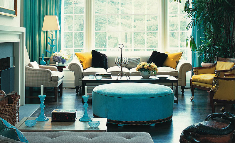
The room we show here is also traditional with a colorful twist. Actually, it's the color — that unexpected turquoise blue — that gives the space its life and lift.
Other well-knowns down through design history have always worked in color.
Even Billy Baldwin, forever famous for his Baldwin brown walls, knew his way around the hot side of the palette: the screaming red "living room in hell" he created for Vogue editor Diana Vreeland is still a design classic.
But perhaps the most effective info I can share is about an architect your husband probably admires, along with everyone else: Le Corbusier, the French modernist who loved straight lines and concrete, actually painted his rooms in pastel colors. Who knew? They were all recorded in black-and-white photographs.
Q: Want heart-healthy furniture?
A: It's on the way. The American Heart Association is working with a New York licensing consultant to bring out a collection of home products that will be called "Home Is Where the Heart Is."
Here's why: Heart disease is the Number One killer of women, more deadly than all forms of cancer combined, according to Kerry Glasser, founder of Concept Marketing
Group (conceptmarketinggroupinc.com). And because women are the main buyers of home furnishings, the Heart Association plans to use stylish products and educational marketing materials to make women more aware of the dangers they face.
Proceeds from sales of "Home Is Where the Heart Is" products will help fund the battle against women's heart disease, Kerry reports. The project is just getting under way; stay tuned.
Rose Bennett Gilbert is the co-author of "Manhattan Style" and six other books on interior design. To find out more about Rose Bennett Gilbert and read features by other Creators Syndicate writers and cartoonists, visit the Creators Syndicate website at www.creators.com.


View Comments